SCB
Transformation for A Significant Move
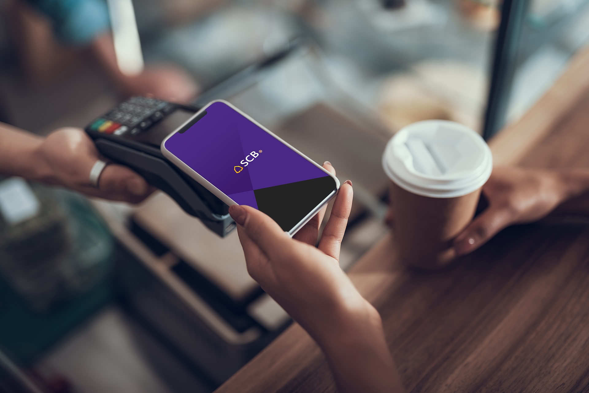
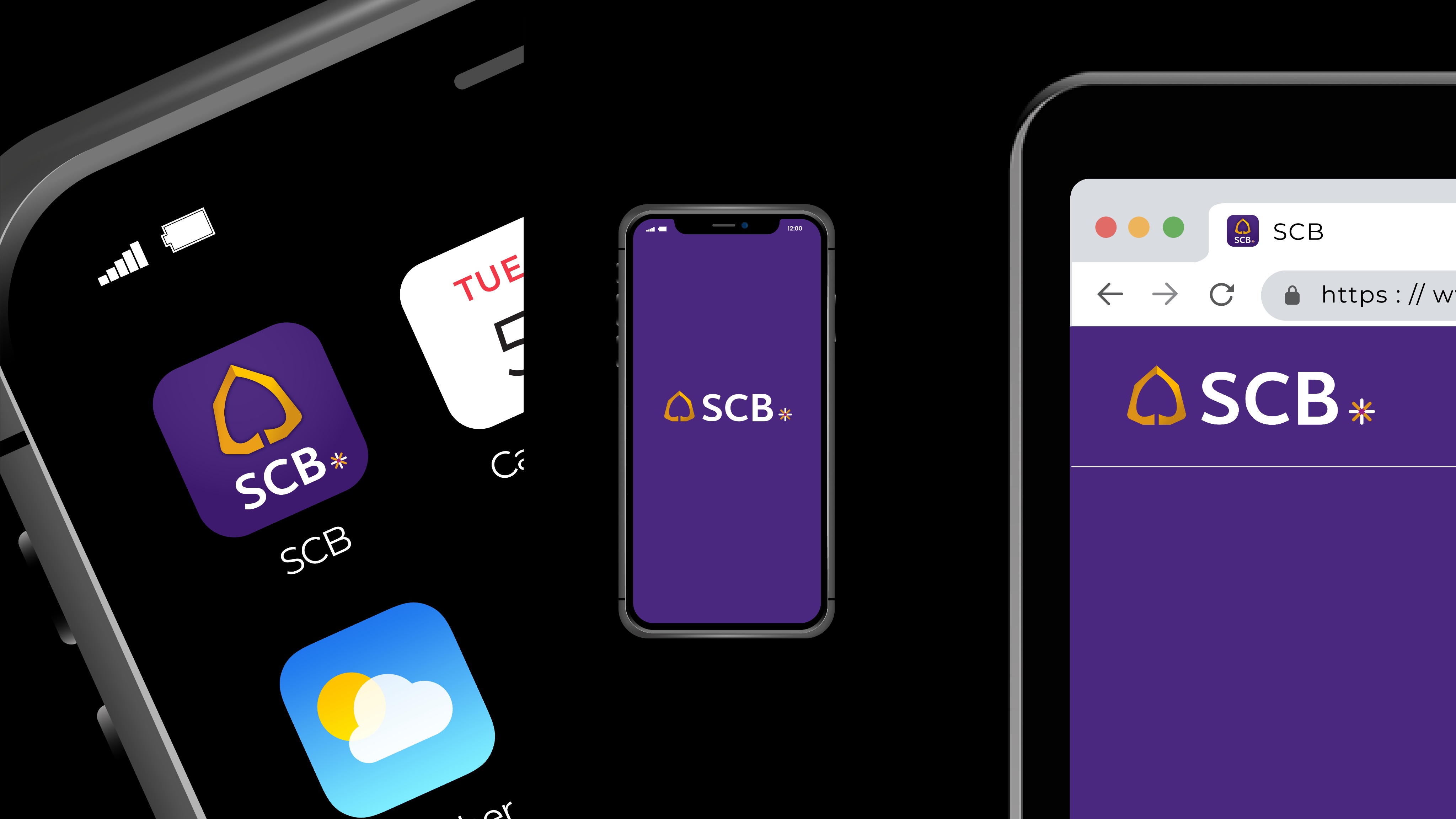
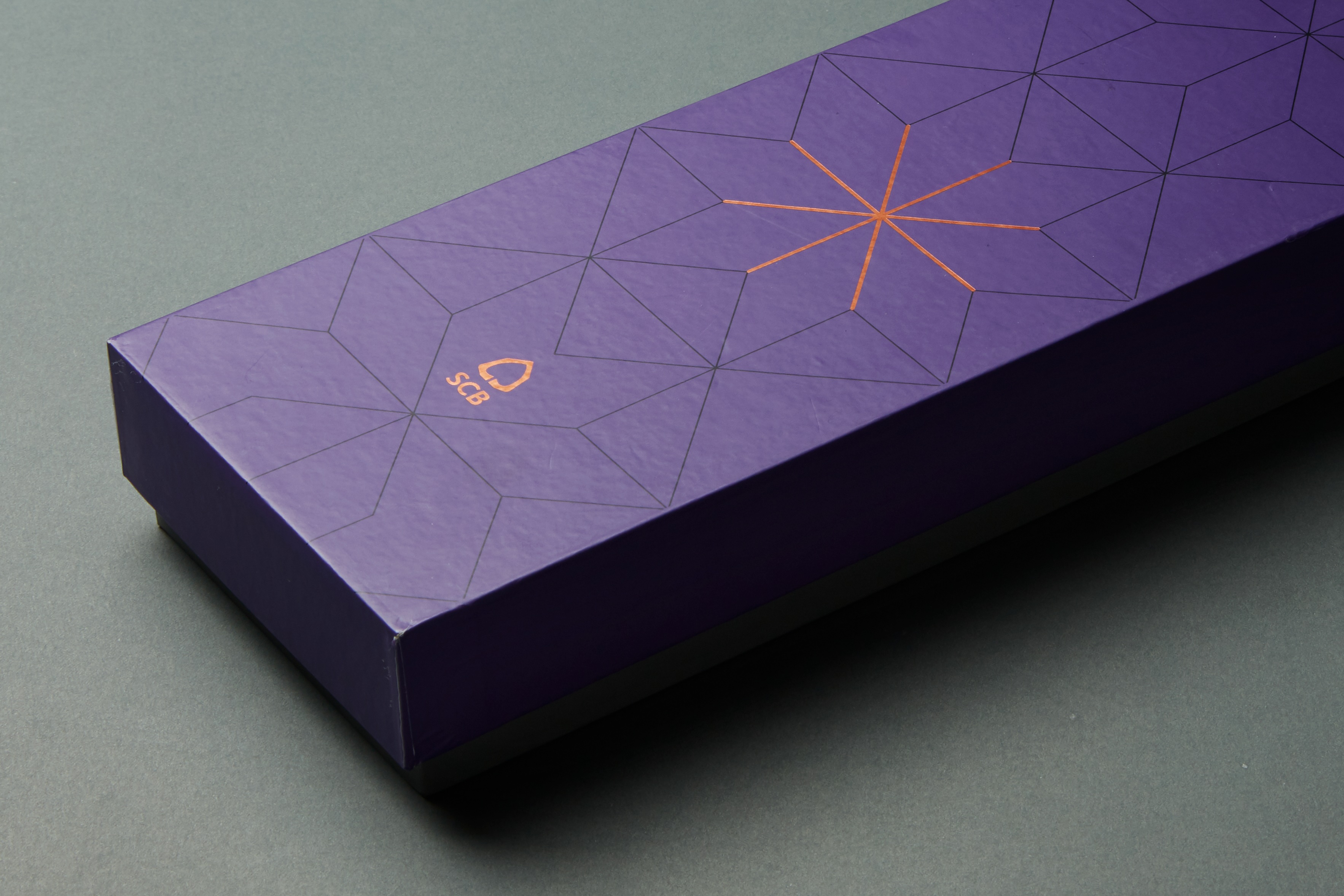
To be able to compete with global competitors in this ever-changing digital era, the banking and finance institutes needed not only adapting itself and its strategy, but a great and unconventional transformation must take place. Therefore, SCBx was created to be a “mothership” for SCB bank and many subsidiaries, to increase flexibility and competitiveness as it aims to become a regional financial technology group spanning a variety of financial businesses and platforms. Bearing that in mind, the visual identity that we created for the brand this gigantic is bringing about its grand legacy infused with the upbeat major transformation it has been through. By redesigning the shape of a Bodhi leaf which is the all-time classic logo of the old brand, we transform it to be curved and round, creating another dimension by adding light and shadow, along with the logotype designed to be symmetric and humanized. ‘SCB’ is followed by an asterisk (*) to emphasize the change in identity that will further continue through new communications to SCB customers.