Brand Communication Strategy
and Integrated Design
and Integrated Design
The functions of packaging are more than what most people think. It protects the product from getting damaged by crash impact, air, and humidity. It delivers significant news and message to the consumers. And most importantly, it “sells” in terms of marketing. The power of packaging can bring either success or failure to a business. Understanding the context of the manufacturer and its customers will help us find the right style of packaging for a product, one that makes the customers understand the content of that product right away. Nevertheless, although graphic and design is a powerful factor, the most important thing always is the “quality” of the product inside the package. “Silent Sales” is what we call the work of packaging design.
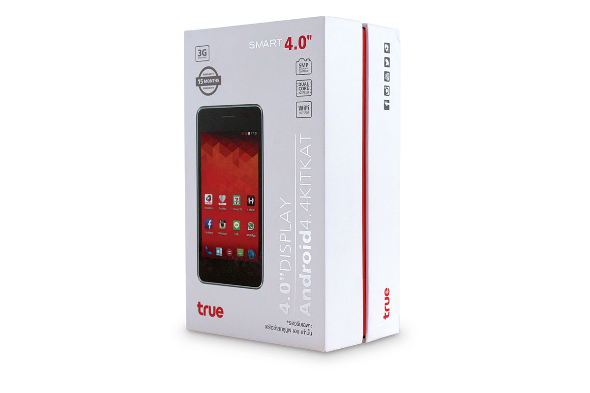
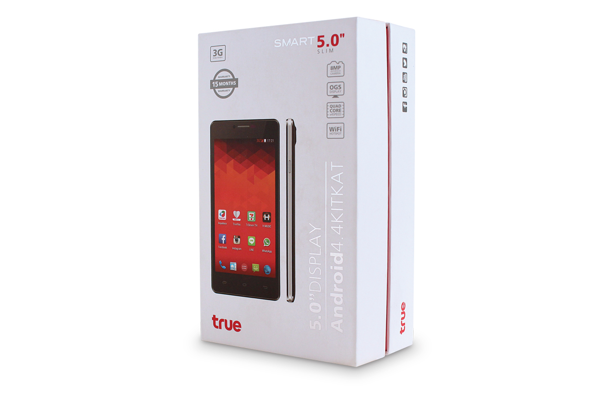
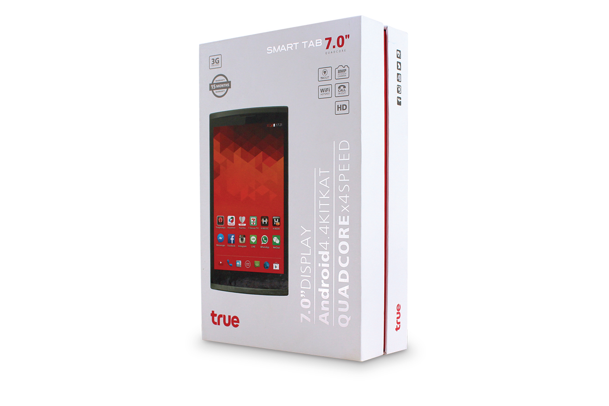
TRUE’s smart phone container package was designed into 3 different styles. With a specific mission to gain accessto the provincial target, the container body was boldly designed to be modern, overstated, yet simple. The features of product were shown clearly to encourage easier and quicker purchasing decision
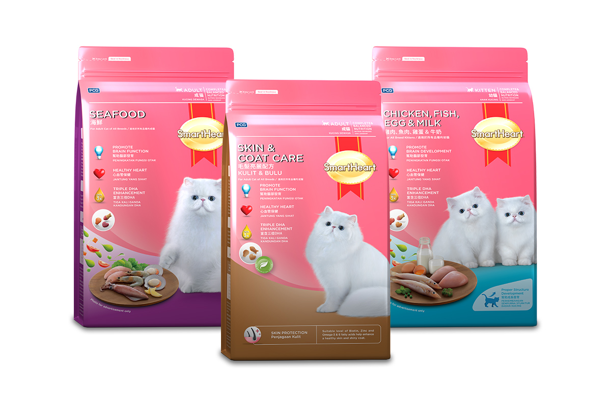
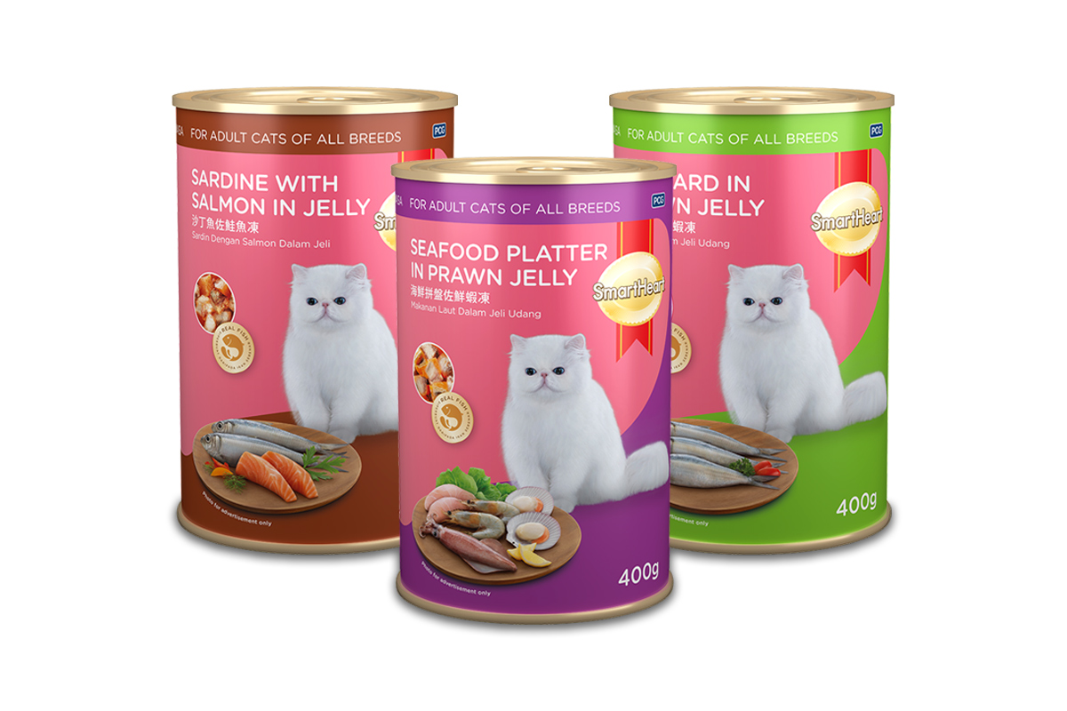
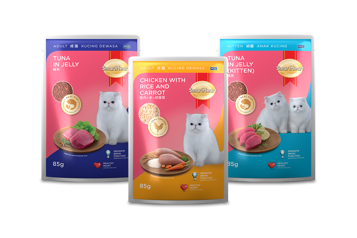
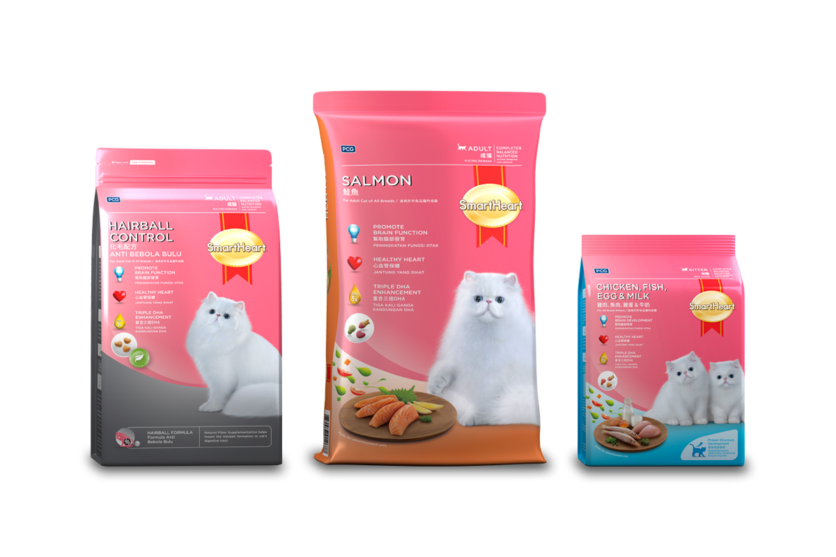
Perfect Companion plans to enter the cat food market in Malaysia with its cat food product called Smart Heart. The packaging design needs to be outstanding and look premium, as well as be more eye-catching on the shelves than other brands. The creative team analysed and conducted a survey in collaboration with the client’s marketing team so as to combine information on marketing and creative ideas in designing Smart Heart’s packaging to be part of the success in creating sales volume.
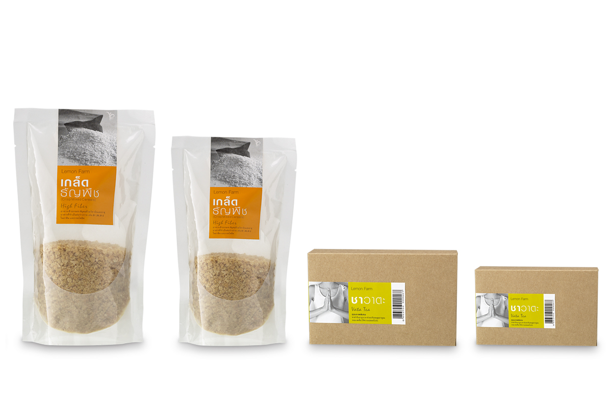
From the beginning, Lemon Farm has presented itself with Bangchak Petroleum’s concept of environment-friendly and community-minded business. It takes the role of a middle person between farmers and consumers. The company focuses on organic agricultural products and healthy products for body and mind. Its concept seems to prefer socialism over capitalism, because it builds a mechanical system that reduces the middle person’s role. The prices of the products are more in favor of the farmers. Small communities receive more opportunities to prosper than in the old system. Thus, the packaging of Lemon Farm must “dress” as modestly as possible to fit its concept and bring sustainable success to the company.
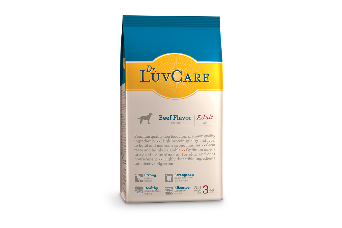
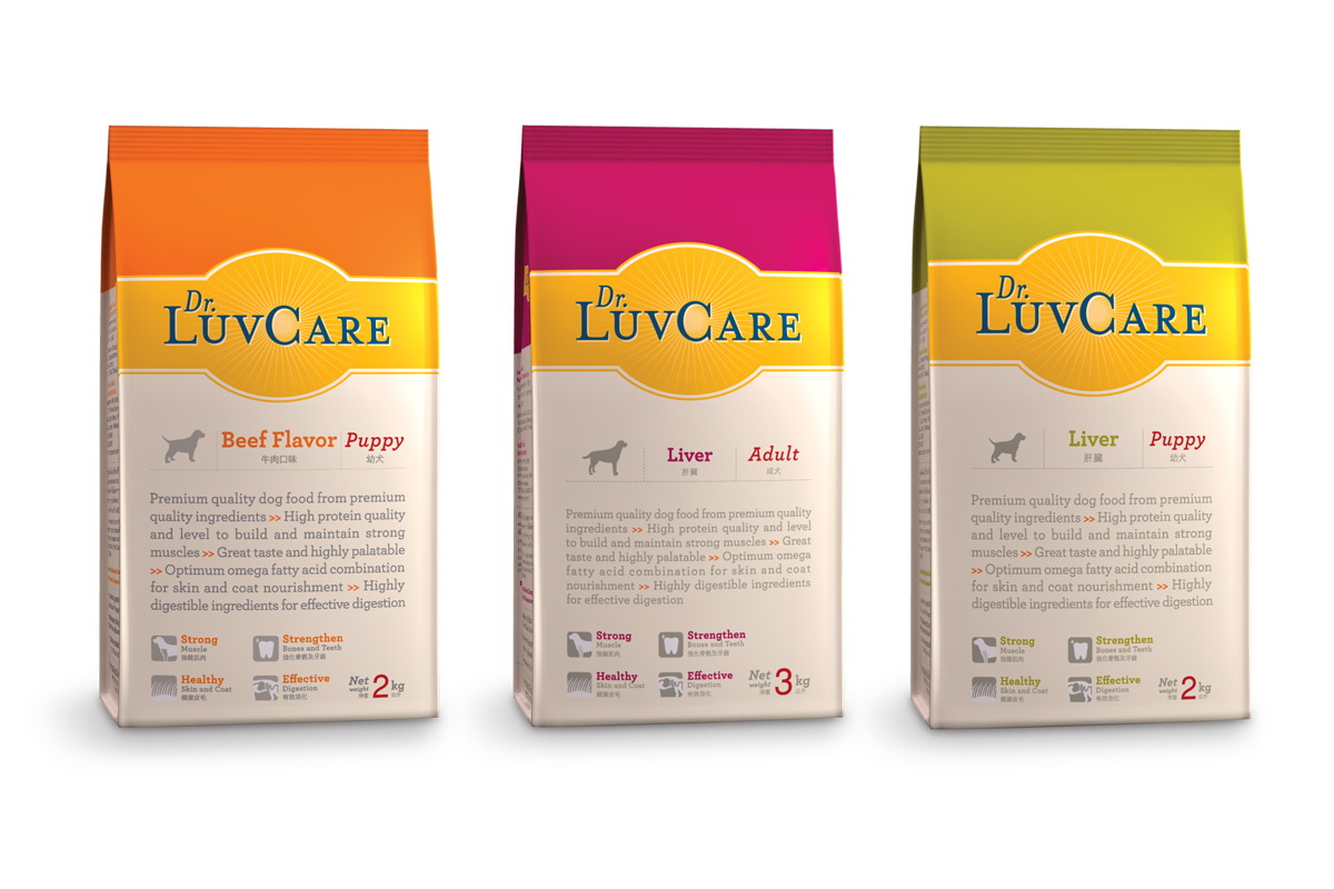
The image of the Dr. Luvcare is an expert with a doctoral degree indog care. Its main product is premium dog food. The brand wants to show itself as a professional researcher who always studies for newer and better formula of nutritious food. To put Dr. Luvcare in the right market position, suitable for the price and quality of their products, we design the packaging that shows simple and humble beauty.
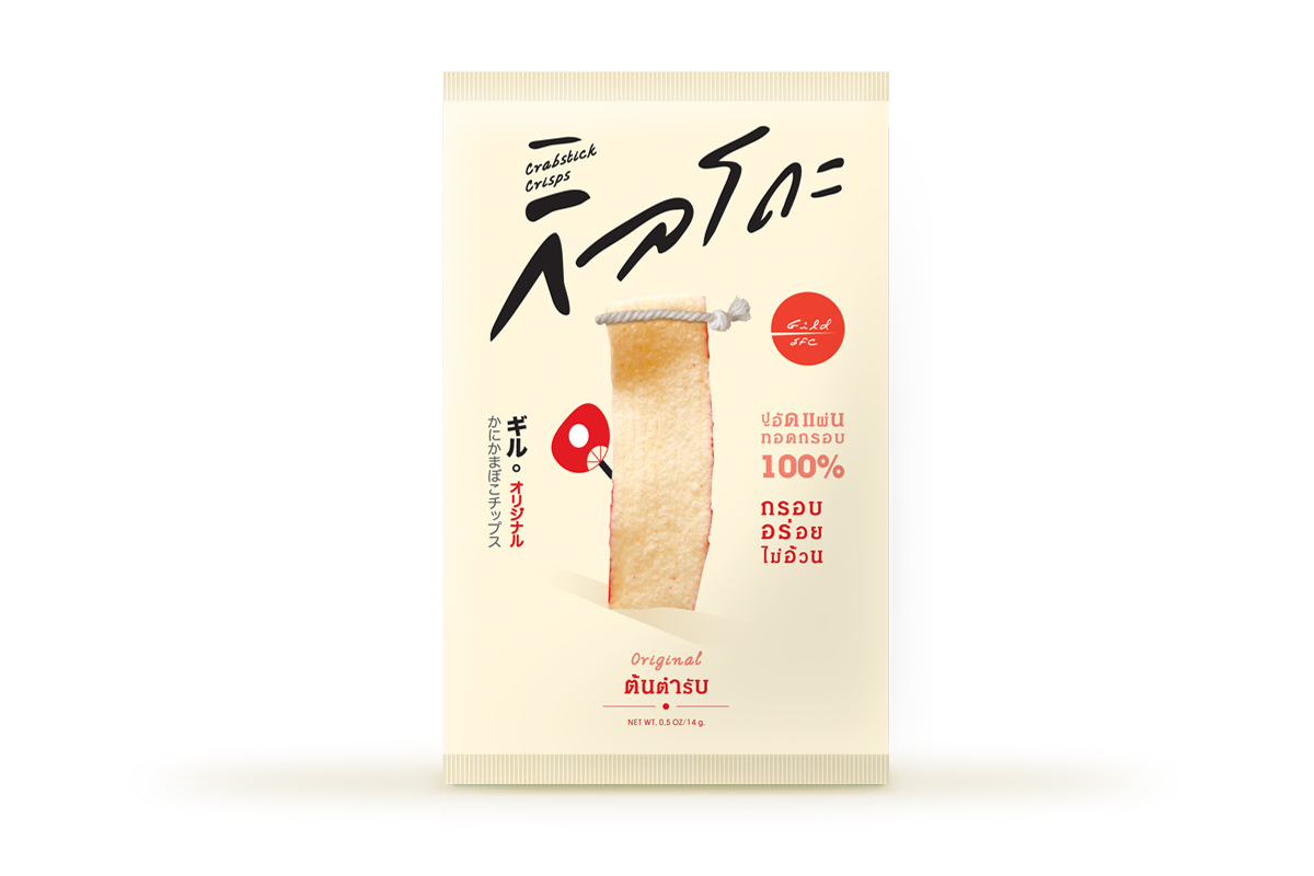
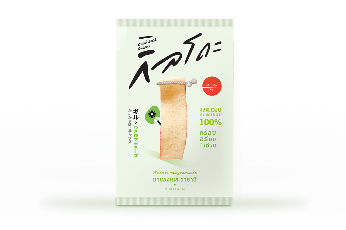
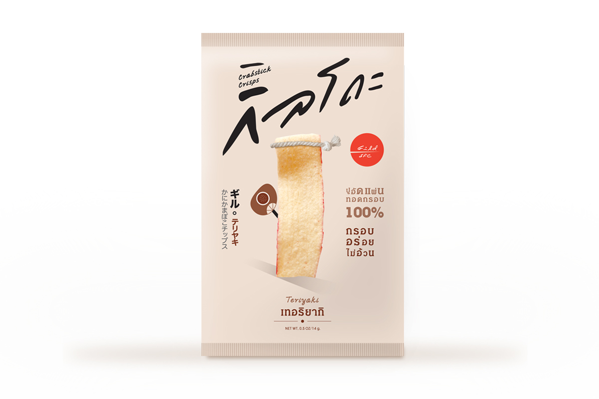
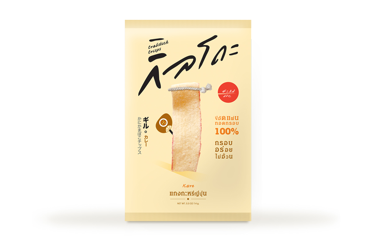
Gildo in Japanese means frying until it’s golden. Packaging design for this crabstick crisps is created with great awareness that the marketing factors leading to success nowadays are indeed many and vary. Whether it is a product itself, a packaging, as well as selling channels, they are all crucial elements that add up to creativity in marketing competition. Therefore, Gildo’s packaging is designed by considering all factors related to customers. The installation of each element, color theory, even the Japanese character; are all utilized to create premium look and enhance the sense of original value of the product.
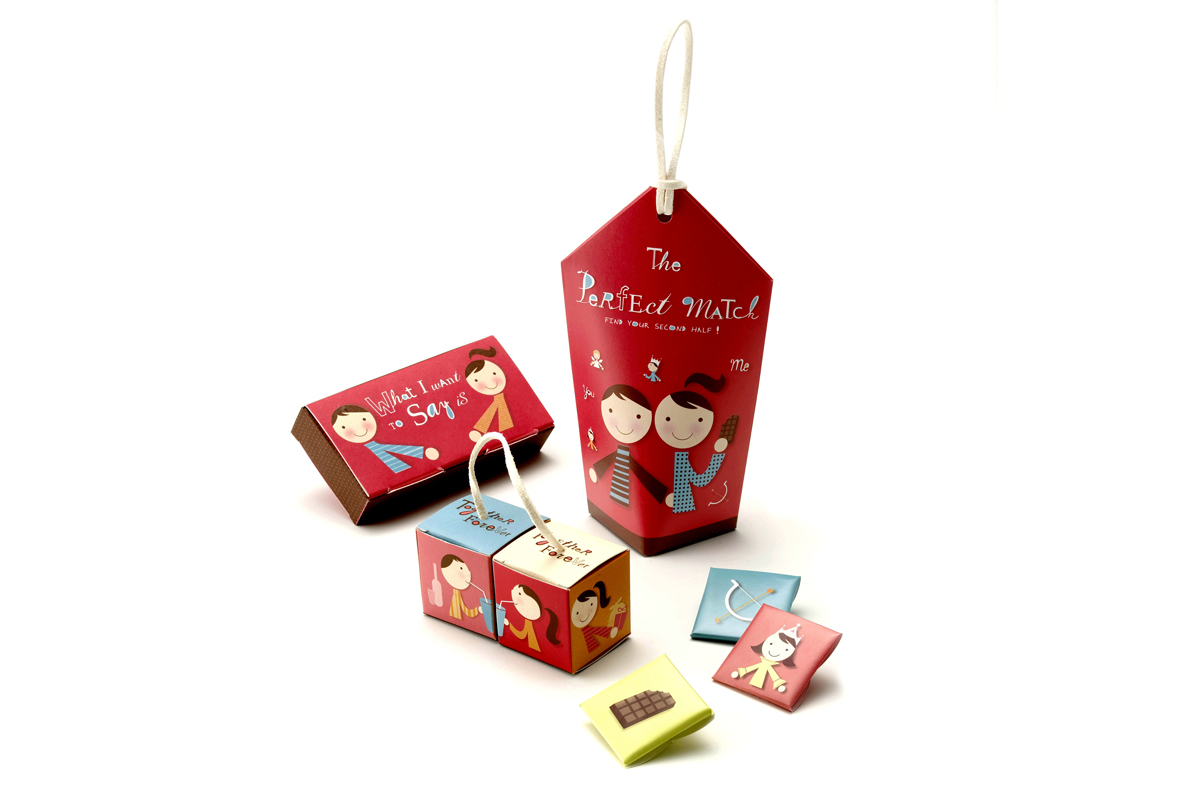
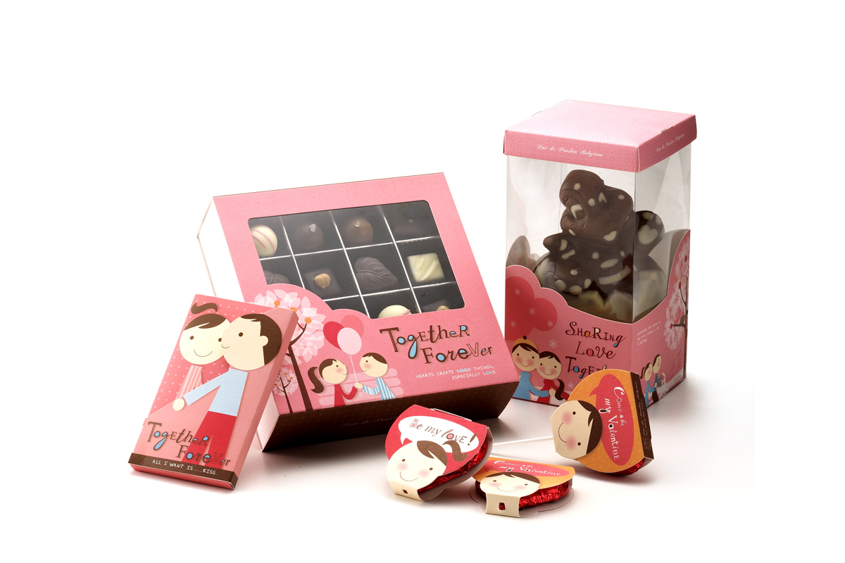
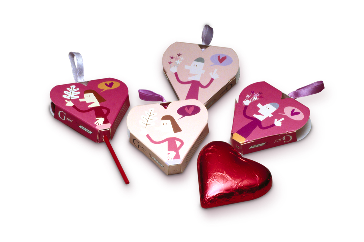
This quality chocolate from Belgium has now come to Thailand. Although eating chocolate is a part of Western culture and it’s not as popular in Thailand as in some other countries, Thai people still care for chocolate during special occasion such as New Year and Valentine’s Day. Its popularity seems to increase among working adults and teenage girls that are fond of Japanese cute-and-innocent trend.
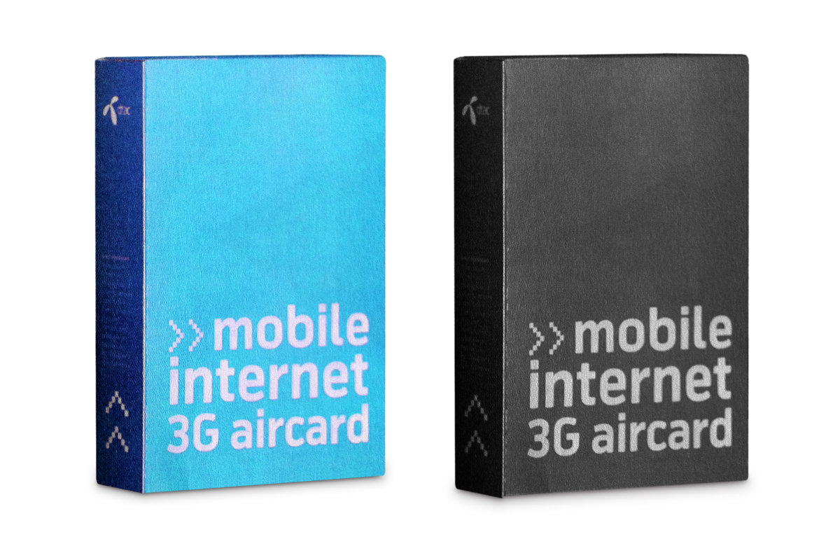
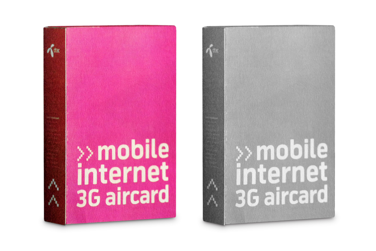
After rebranding and changing its slogan to the new brand promise “Feel Goood,” DTAC became very successful in the mobile phone market. This reflects that all designers must stick to the principles from the “branding” bible, but meanwhile, for the best creative result, they should use the best of skills to look for the little loophole to escape from such rules and regulations. Nevertheless, designers should still strictly maintain the position of the brand. Otherwise, the customers might be confused or lose their confidence in the brand.
Duty-free shop is the last shopping spot for tourists before they get on the plane and go home. It is the perfect time for the leftover pocket money to be spent on a pair of nice trousers and some souvenirs. What make the children at home very happy? Of course, sweets and snacks seem to be the sweetest answer. And the least besides pleasure of tasting, it tells them where their parents
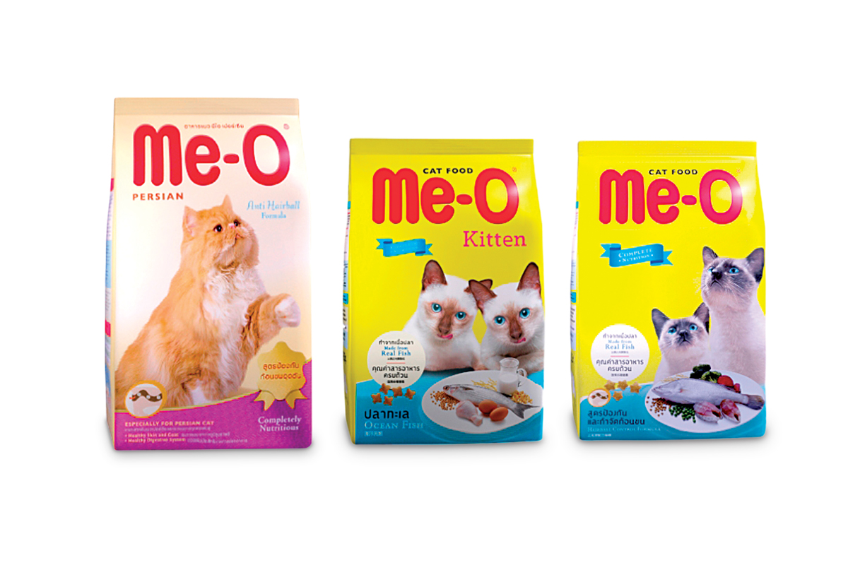
Cat food has similar concept to dog food. This brand has been well known to the people for a long time and it is known to be the first name that came to the mind of cat owners. What pleases cat lovers is the presentation of the food quality,the list of ingredients that look so yummy even to a human!
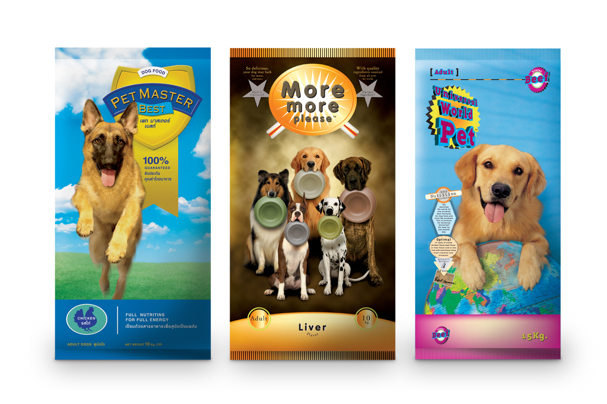
Packaging for dog food should present the benefits that the dog will get from eating the food, e.g. energy, smartness, cuteness, healthy hair and skin. It should directly represent the content of the product inside the package.
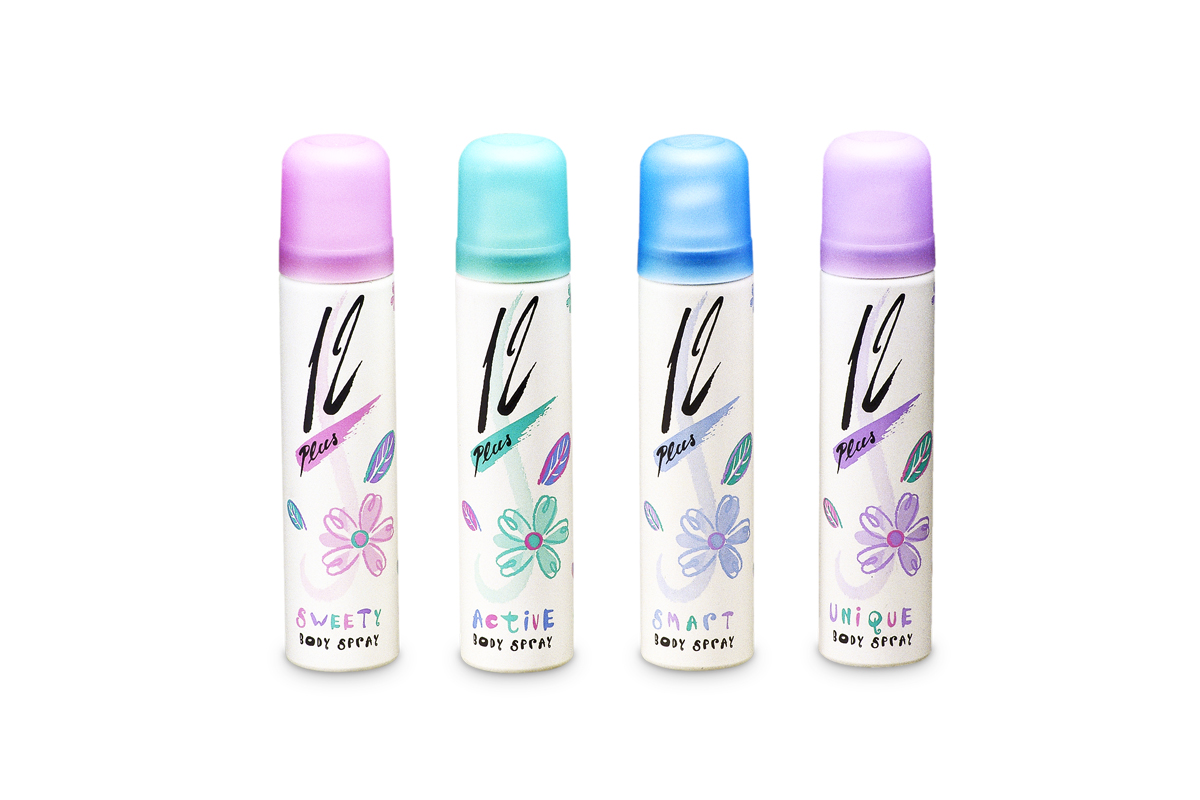
Because the designing language is to be communicated with people, when the target of communication is 12 years old; the design must be created on basis of understanding these teenager’s lifestyles and thinking process. Asking when people are caught between being a child and an adult, what is it that they want; the new communication is tailored made.
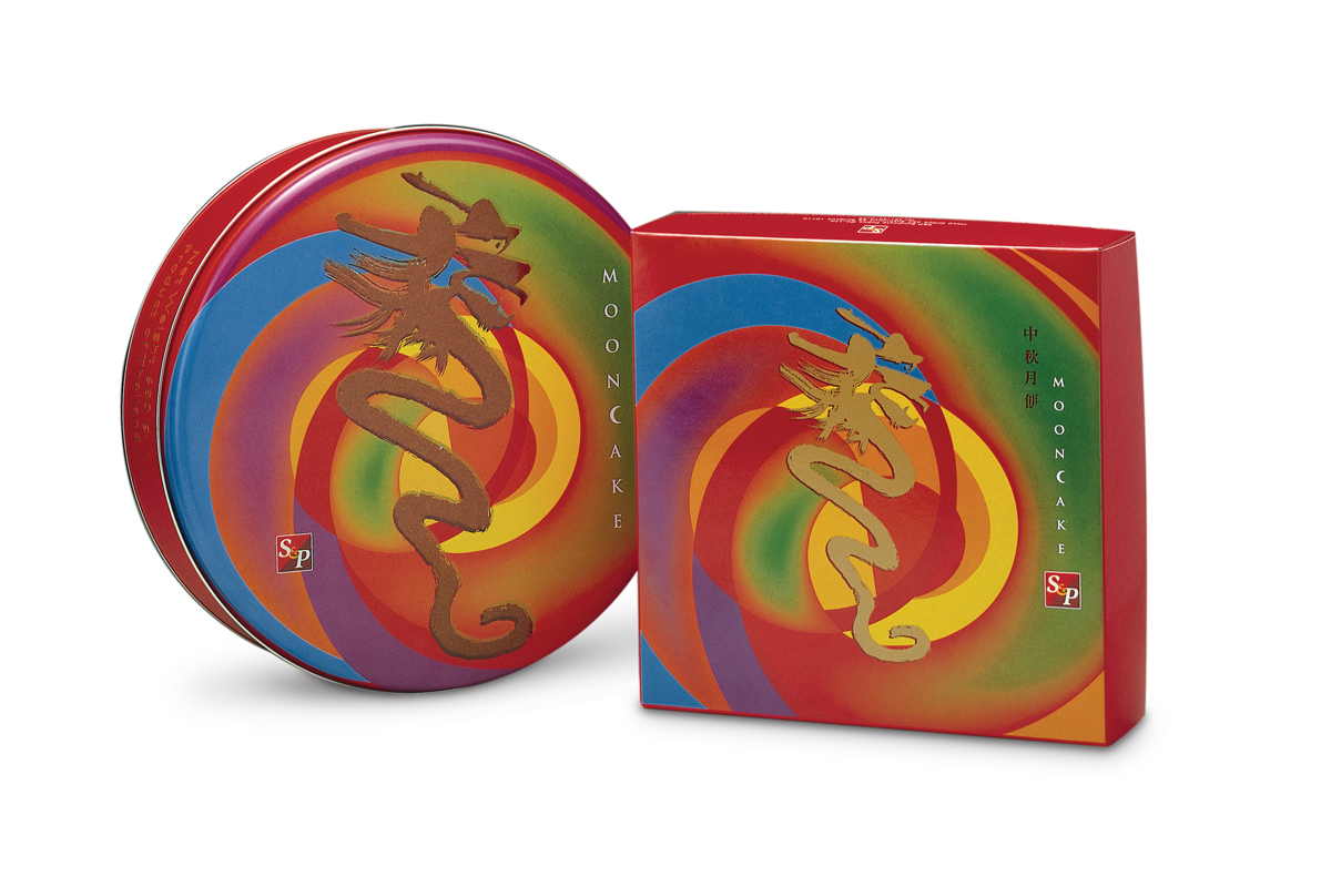
S&P is the owner of the slogan “This name means delicious food. ” They have come a long way in the business and have a insight understanding of what consumers want. Today, “moon cake” is considered one of the highly-invested markets. Its packaging was designed with bright colors and patterns, attracting new generation of Chinese people with strong purchasing power. At that time it was the year 2000, year of the dragon. Since dragon is a powerful symbol, it was surely there as the graphic design on the packaging.