Brand Communication Strategy
and Integrated Design
and Integrated Design
The word comes from ancient Greek "logos," which means"representative of God." Similarly, the word "logo" itself means "representative of a large number of people." It is presented in the highest form of symbol through the use of letters or pictures. However, a logo is much more powerful than just a symbol. Logos of some organizations have the power to change or create corporate culture and value, on going marketing awareness, brand building/ brand essence, and corporate social responsibility (CSR). But no matter what kind of power it has, this representive of God is the most difficult and takes the longest time to create, comparing to other kinds of design.
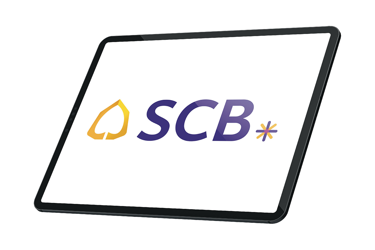
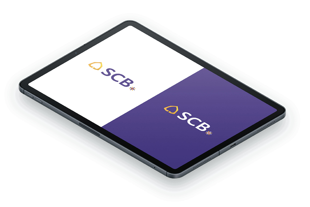
Changes in the digital world have resulted in several industries having to adapt themselves, including the banking and finance industries. Creating a new image for SCB is therefore the first step to enabling the organization to move forward. The brief of the project was to create an image to be in line with the current situation. We have redesigned the shape of a Bodhi leaf to be curved and round, creating another dimension by adding light and shadow, and creating the logotype to be symmetric and humanized. ‘SCB’ is followed by an asterisk (*) to emphasize the change in identity that will further continue through new communications to SCB customers.
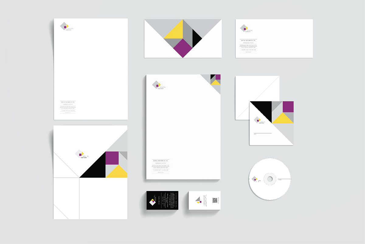
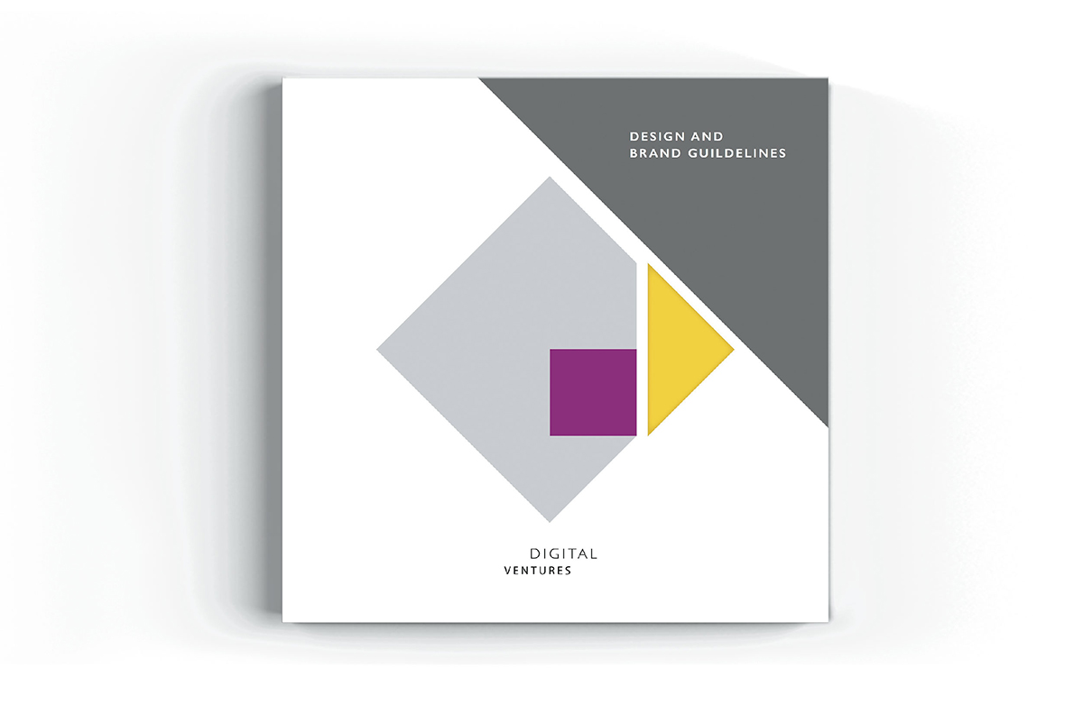
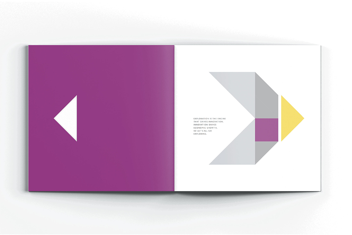
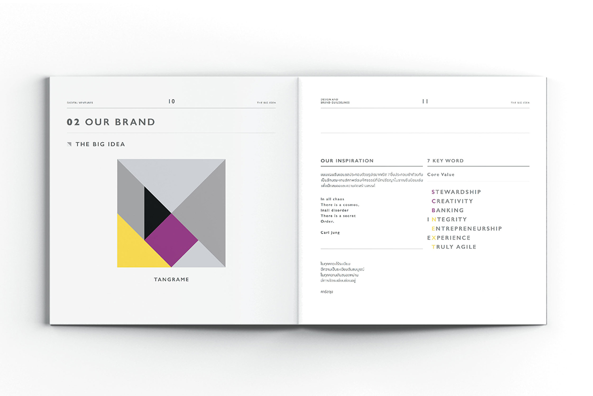
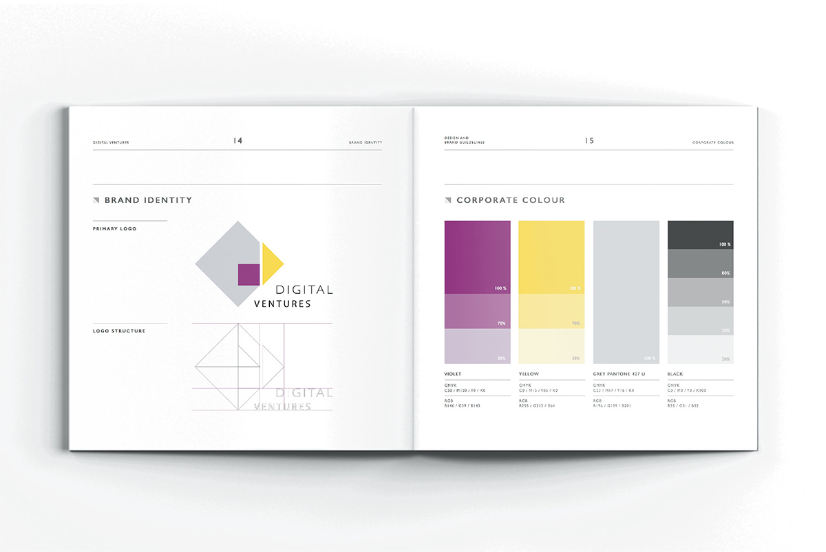
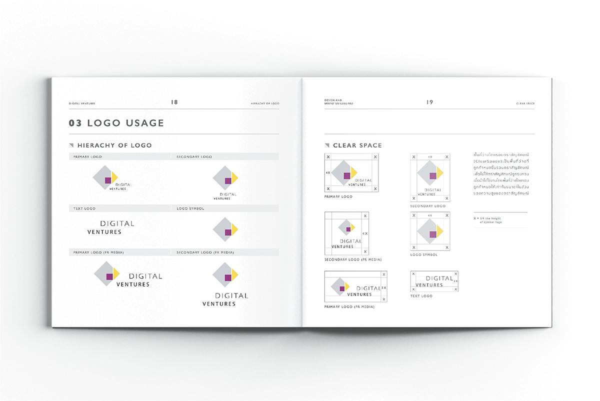
A significant mission of Digital Ventures or DV—a company under Siam Commercial Bank—is to search for new knowledge about innovation, technology, and investments especially in start-ups, so as to continue the business of the bank to keep up with the digital world. The vision of the organization as mentioned above gave rise to the concept of tangram (a dissection puzzle consisting of seven flat shapes). A tangram originated in China during the Song Dynasty. Only seven pieces can form the specific shapes of over different 500 patterns. This combines creativity and thinking outside the box which is compatible with the identity and personality of DV—a person who creates and innovates with new ideas to adjust to the real world in constant change.
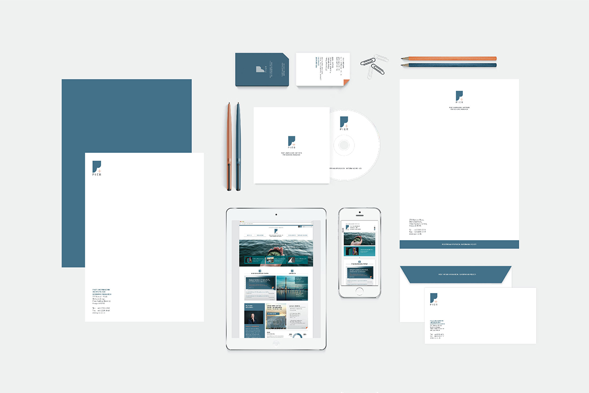
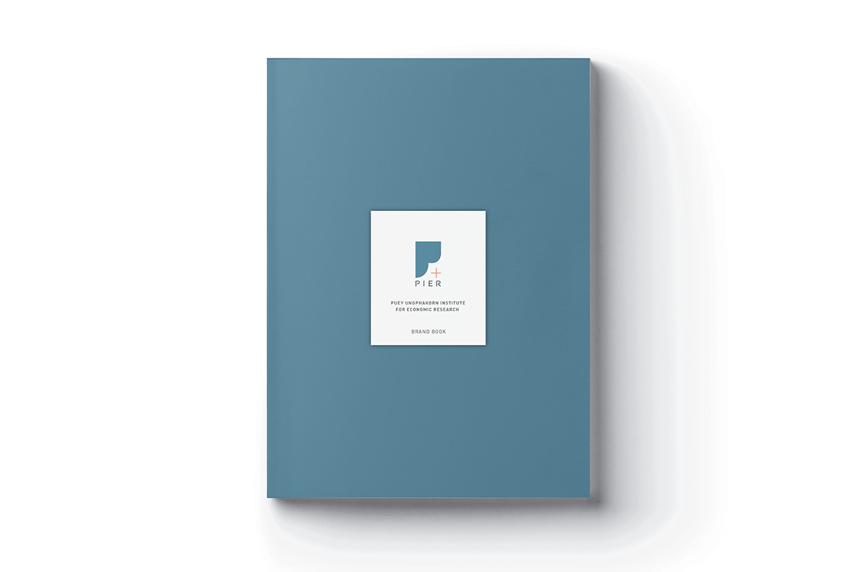
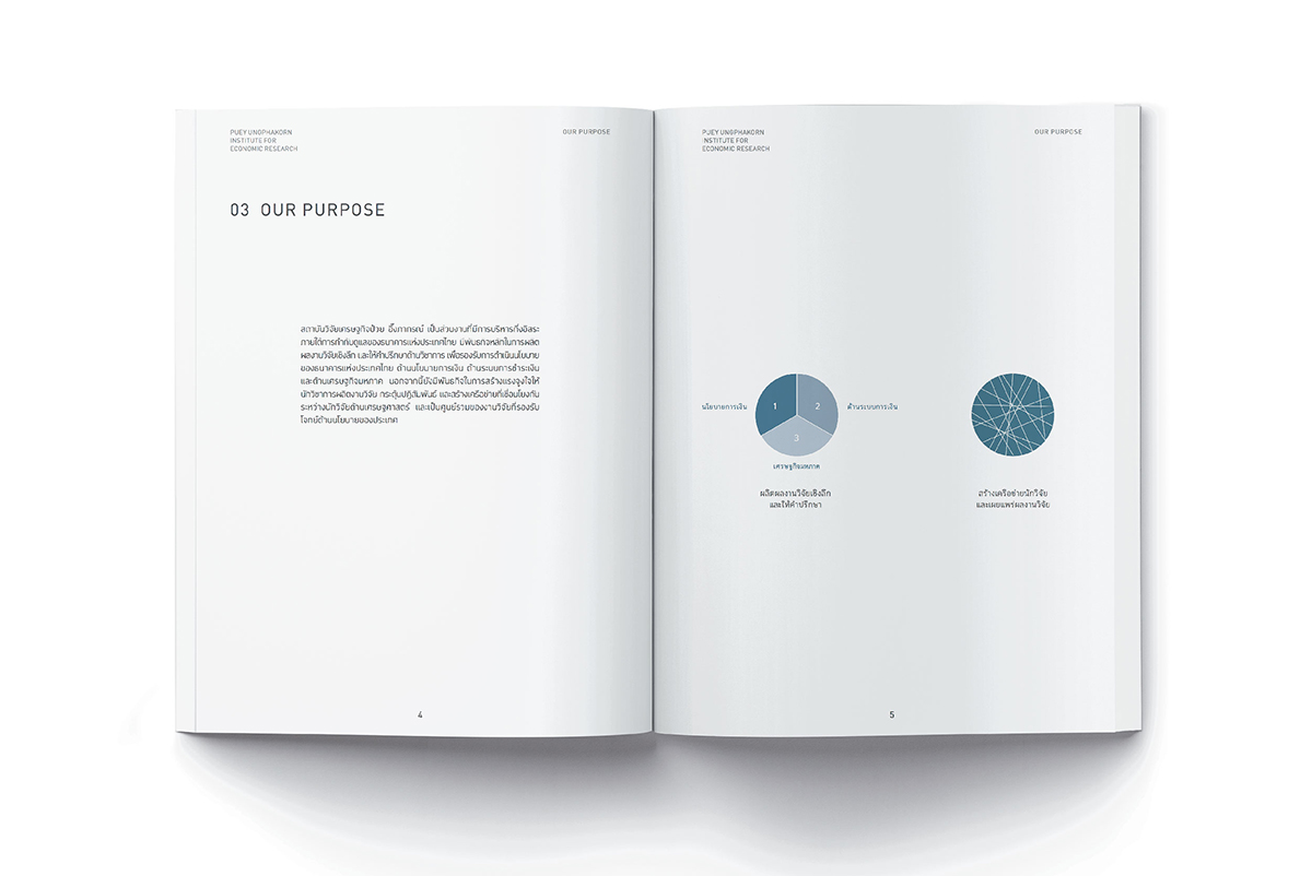
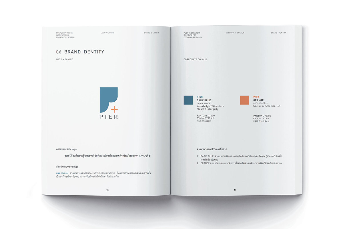
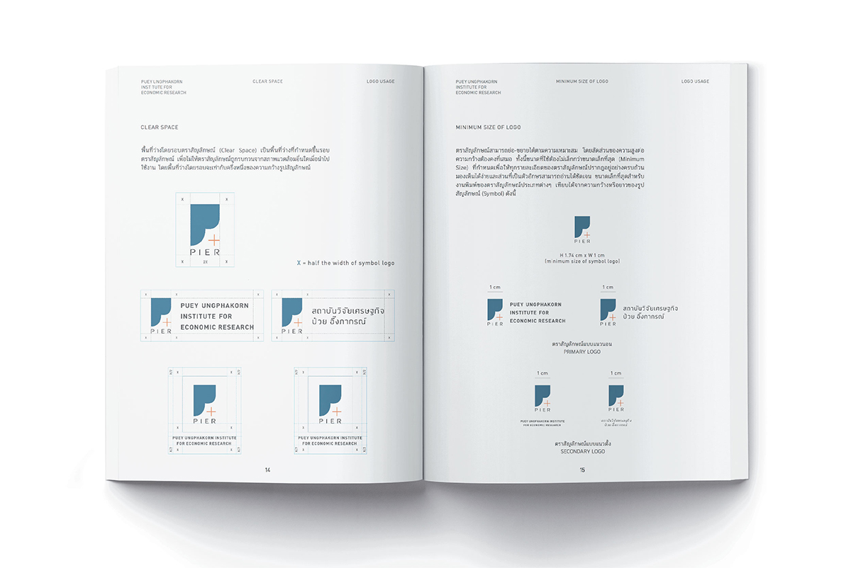
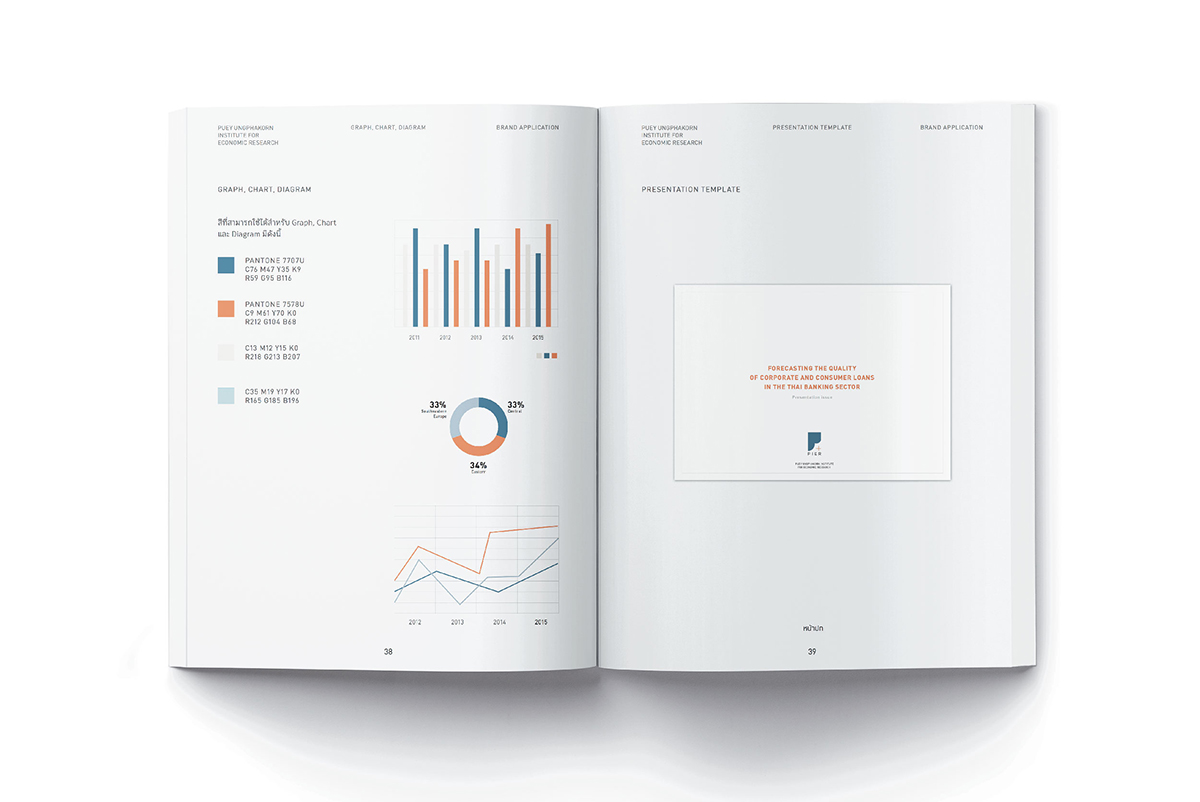
Puey Ungphakorn Institute for Economic Research (PIER), an independent organization under the governance of the Bank of Thailand, is established to conduct economic research, disseminate quality research, to be the centre connecting researchers and resources, as well as making research work a foundation for specifying the economic policy of the country. The establishment of this research institute, therefore, has to be carried out in correlation with the creation of its identity that reflects such a standing point. The challenge for this project is to integrate design principles, understand the objective and personality of the economic institute, and cover the objective both in terms of its duty to “connect” with researchers and to designate policy based on research itself.
SCB set up SCB Abacus in order to respond to the significance of AI technology and the benefit of using data—the major foundation to develop business competency in the modern world. We have, therefore, designed the identity to communicate the transformation of modern-day business requiring the consideration of new information from new angles. The insight was derived from the massive amount of data, leading to the development to continue business (re-imaging data) by communicating through the connection of two dots in the symbol of ‘a’. Gradient and radiant colours create light from the inside to outside reflecting the flowing energy and growth, as well as creating a new dimension and the image of the modernity of the organization in the digital era.
Logo concept of Health Museum is based on having good health concerns for the growth of all ages – from birth till death as the natural life cycle of human beings, which is similar to the growth of Nautilus Shell. Each point in the logo represents the 10 zones of the exhibited content in Health Museum.
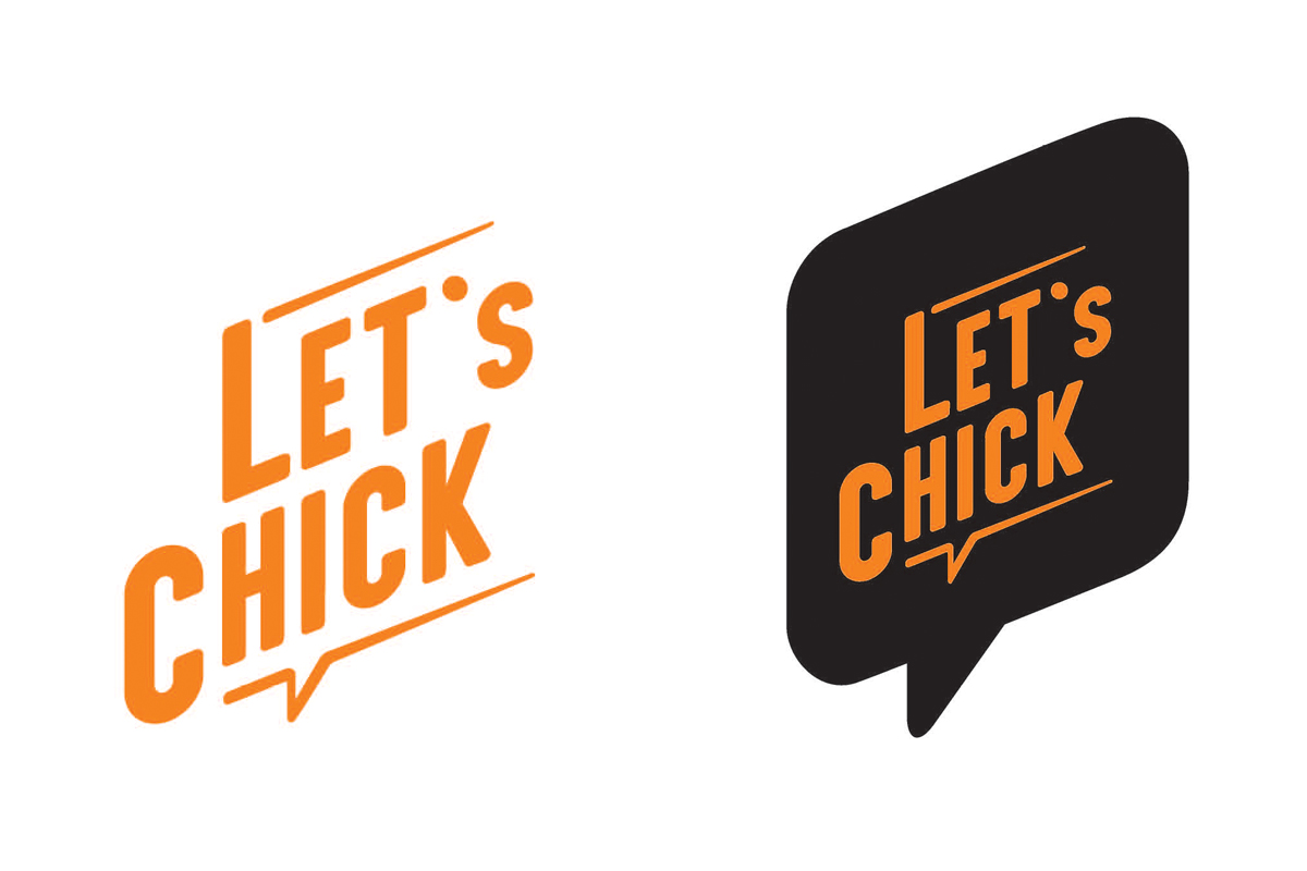
We started from creating the brand attribute: fun & active, friendly, new experience, social, and the brand promise is “You’ll enjoy”. This is important for creating the brand strategy and brand communication. The design of the brand identity using a speech bubble with persuasive content reflects the brand image that is friendly and approachable. Greeting messages or emotional expressions on the packaging ensure communication in the future.
The project for the Excise Department was immense and complicated. We began our full process of work by exploring, analyzing, and synthesizing the systems of the organization, as well as its viewpoint throughout the past years to find its primary root and build corporate attribute from within, so that we established the criteria for all our designs based on it. Our work was hereby a result of building organization’s personality and finding solution on the office space usage called by the staff of the Excise Department “Smart Office.” Our understanding about manufacturing process and the time limit that we had require us to have broad and complex knowledge in order to accomplish this project. However, we do have what we need and good beginning is already half-way winning.
After rebranding and changing its slogan to the new brand promise “Feel Goood,” DTAC becamevery successful in the mobile phone market. This reflects that all designers must stick to theprinciples from the “branding” bible, but meanwhile, for the best creative result, they should use the best of skills to look for the little loophole toescape from such rules and regulations. Nevertheless, designers should still strictly maintain the position of the brand. Other wise, the customers might beconfused or lose their confidence in the brand.
After rebranding and changing its slogan to the new brand promise “Feel Goood,” DTAC becamevery successful in the mobile phone market. This reflects that all designers must stick to theprinciples from the “branding” bible, but meanwhile, for the best creative result, they should use the best of skills to look for the little loophole toescape from such rules and regulations.
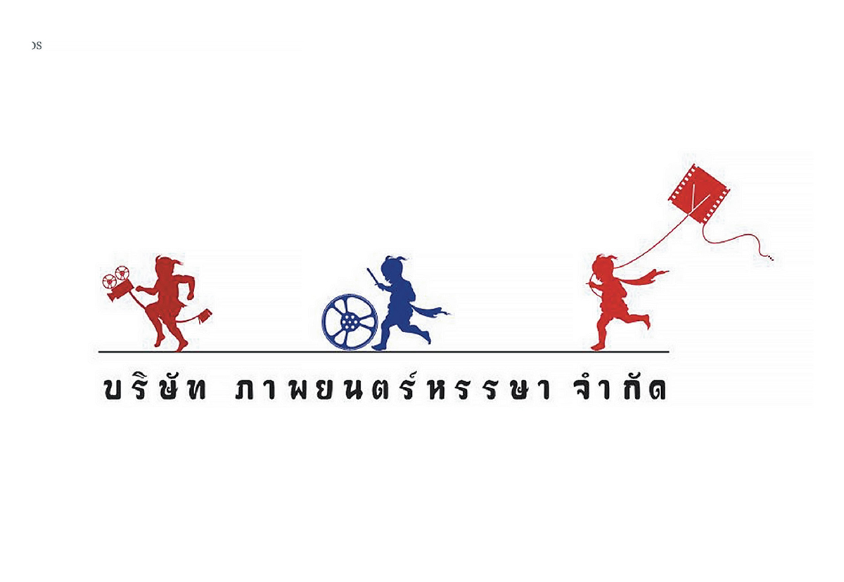
Hansa Film
Nonsri Nimibutr or Ui, the hundredmillion-
dollar director, has always
been clear about what he wants.
So, the logo of Hansa Film comes out
as it is. Being a world-class director,
he wants to openly express the value
of Thai culture through the use of
“vernacular” or the local dialect.
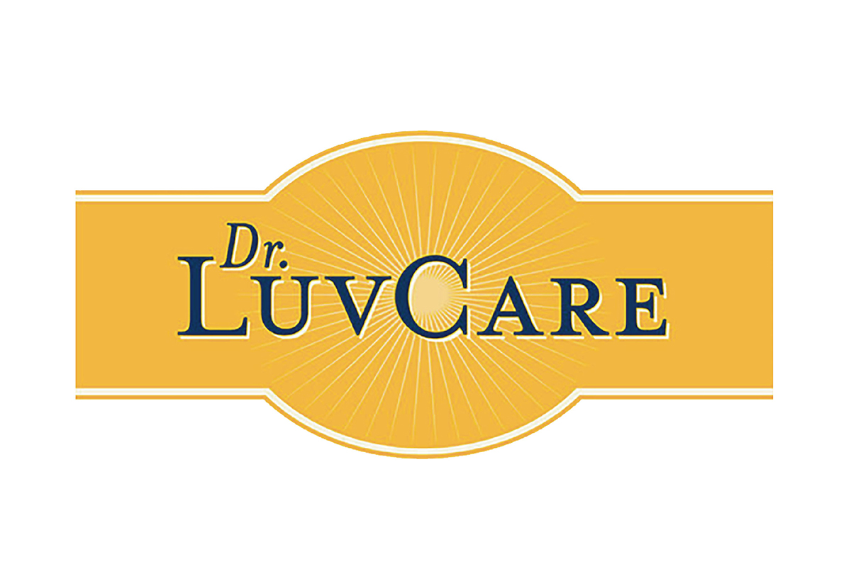
Dr. Luvcare
Love & Care is the foundation of the brand
“Dr. Luvcare.” The company has
been selling dog food for morethan 6 years,
during the time thatthe economy was
unpredictably changing like the wave and
the wind. However, Dr. Luvcare was able
toincrease its demand in the market and
push itself into the premium product group.
There is a kind of logo called “logotype” which combines letters, abbreviations, words, syllables, etc. It is mostlyused by organizations that expectwh oever sees their logo to pronounceit too. This might result from the earlyperiod of brand awareness building, when the target group was encouragedto utter some words in order to take inthe message of the brand.
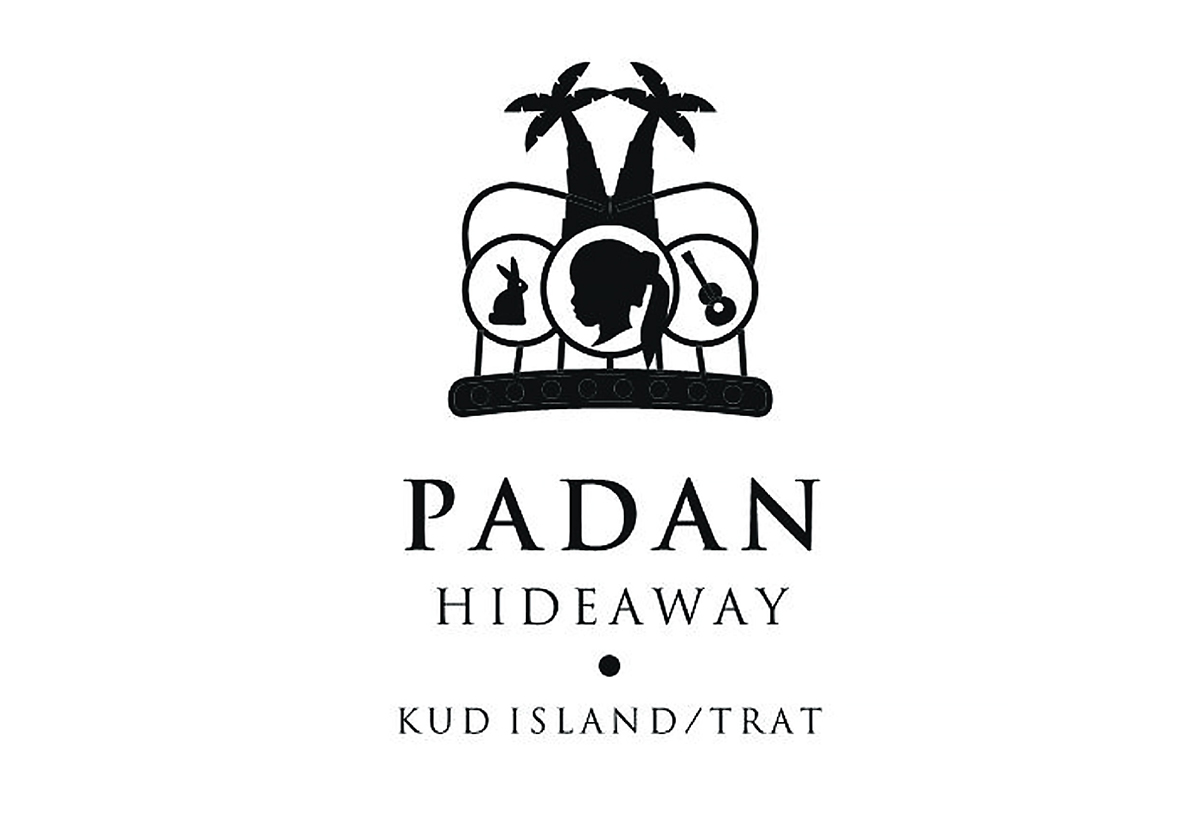
Tid Koh means getting caught up isolate in the island. This is a small subsidiary company in hotel industry, owned by a family who views it as a “micro business.” Tid Koh was established to support commercial activities of Padan Resort so that its management is flexibly easierand more convenient, as to say small business transactions can be doneseparately. After seeing this fantasticlogo, do you want to be ‘Tid Koh’sometime?
The idea of “less is more”
is often usedin a project with noble taste or
a brandthat is already known for high creativity.
From time to time the design mightlook as
if it has not been designed at all.
Call it paradox, we often found that lesseffort
in communication resulted inmore
understanding.
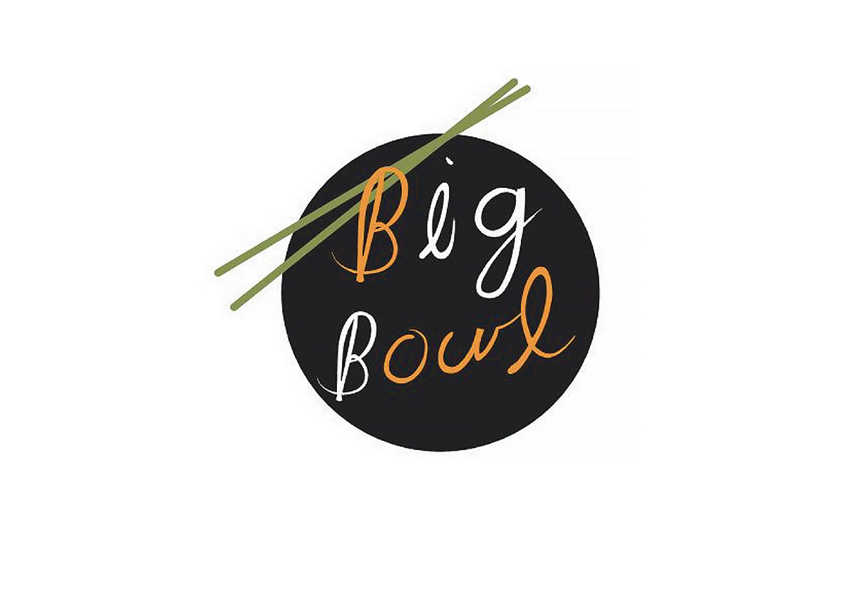
Big Bowl is a pasta/noodle restaurant, a new brand that needs people to say some words in their mind when they see its logo. This will quickly and appropriately build corporate awareness in the target group.
Hotel and resort business is a part of hospitality service industry. Creating brand identity for a 7-star hotel andresort, gave us a valuable experience.However, designing the logo and brandidentity for the same kind of business but without those stars that categorize international classes, also gave us agreat impression and a totally differentkind of precious experience.
Only traditional Chinese silk can render the coolness, smoothness and comfort upon being worn. The origin of Chinese silk goes back over several hundred years. It has become popular among people around the world as garments and they have even become collectible items. The identity from the past until the present makes the logo considerably contemporary. Lines derived from the identity of interior design are blended and applied until becoming Arabic lettering that reads well and clearly communicates this brand of Chinese silk.
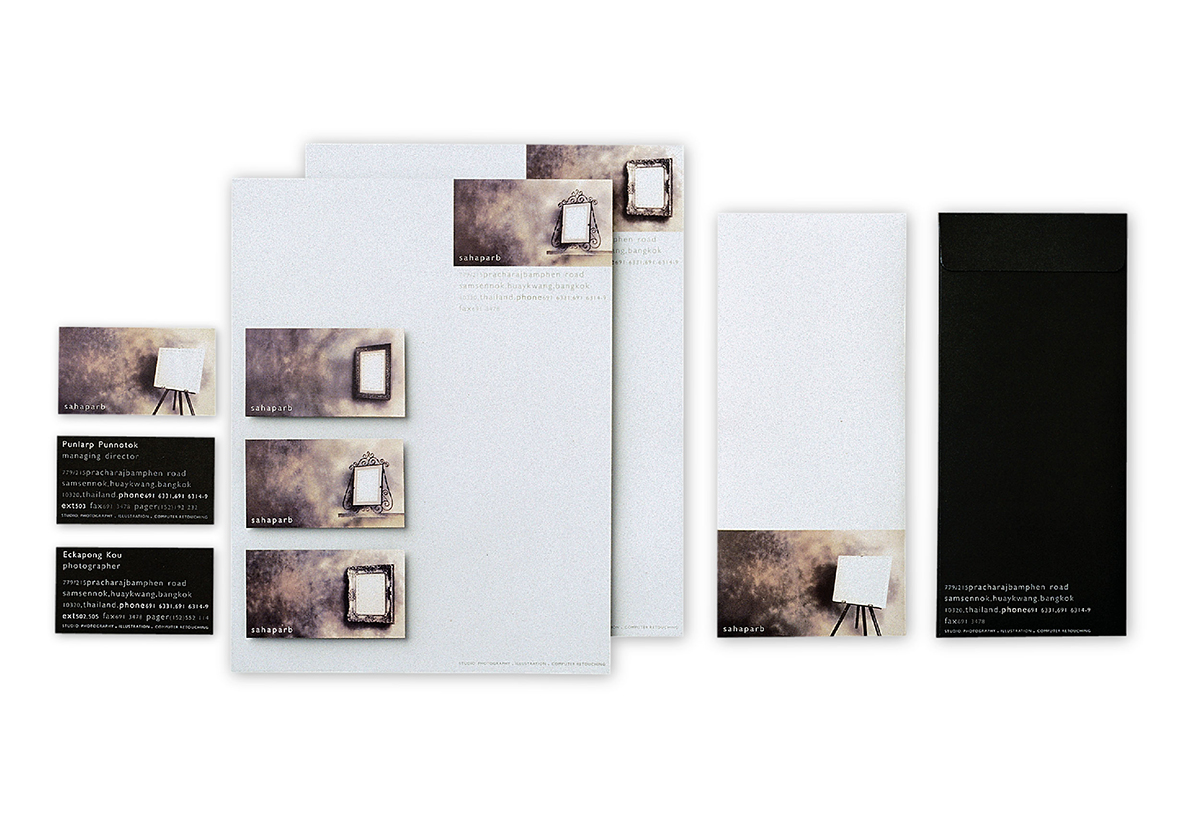
Saha, in Thai, means the unison of groups and parties, while ‘Bhap’ means picture. Thus, Saha Bhap bears a simple meaning of gathering together pictures, in all means and kinds. When the works of photo shooting and picture illustrating with many 3Ds and 2Ds techniques are resided together in one single studio; the frame of this very picture is then designed in various characters, to reflect broad creative skills in advertising communication.
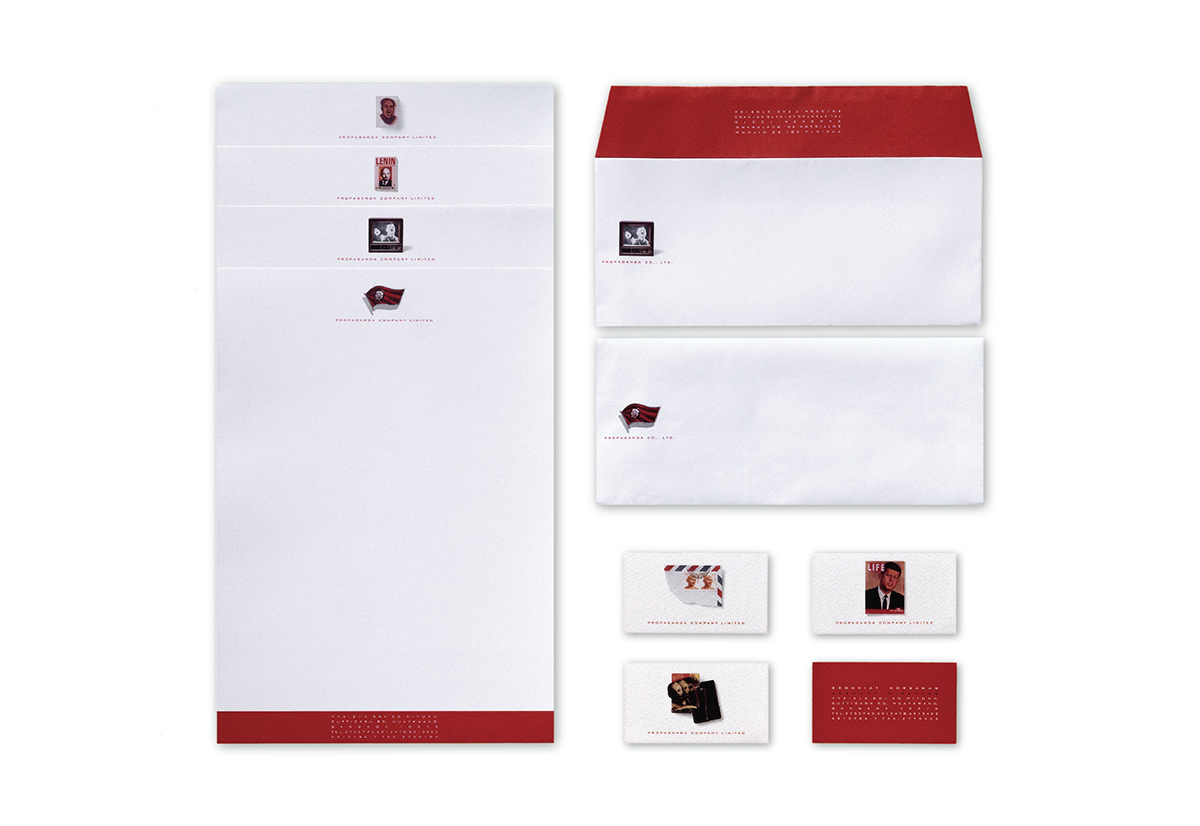
Propaganda Company utilizes the act of calling people into action as its name to create brand awareness and eventually make the society remember it. This effort could be considered higheffective for the company now is well-recognized by the people.
Personal identity of an insurance agent can be compared to a rift or a tear. It makes the object looks different butstill its main function is usable. The most important thing is to make clients remember this person from just seeinghis/her name card at that very firstmoment.
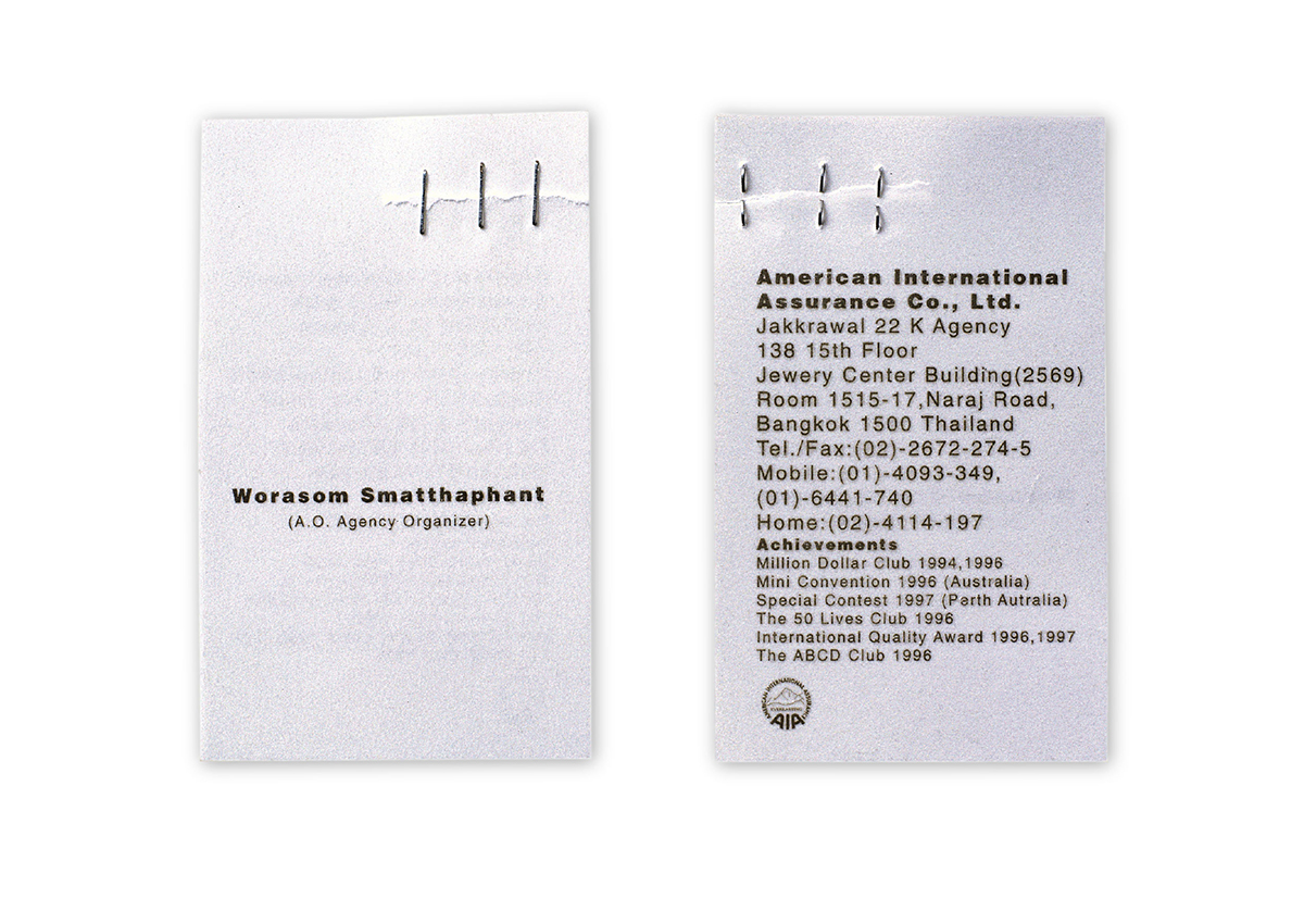
A name card is simply a representa-tive of a person. Its only task is tointroduce you to other people andhelps them remember you afterward. Presenting the old picture of the card holder on his or her name cardis an amazingly effective idea.Because naturally it is one of people’shabit to be interested in seeing whata person looked like in the past, forthey can simply enjoy comparing itto how the person looks in the present.So, this kind of name card puts asmile on those who receive it andhelps make the first conversation full of good feelings.

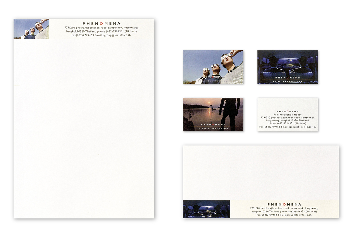
To truly live up to the company’s name, the phenomenon occurs right on name cards, letter papers, and envelopes. Not only stamping the brand deeper into people’s perception, the visual language also help senhancing the power of the film language which is mainly the very business of the company.
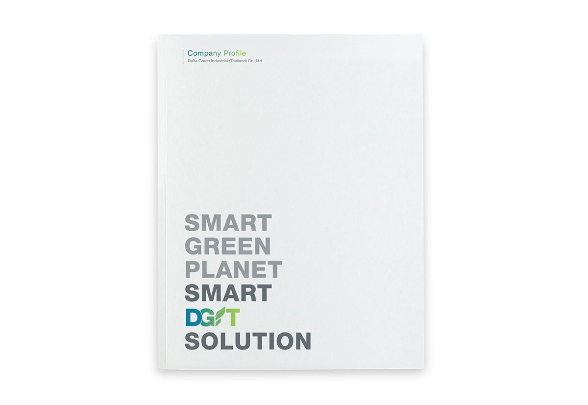
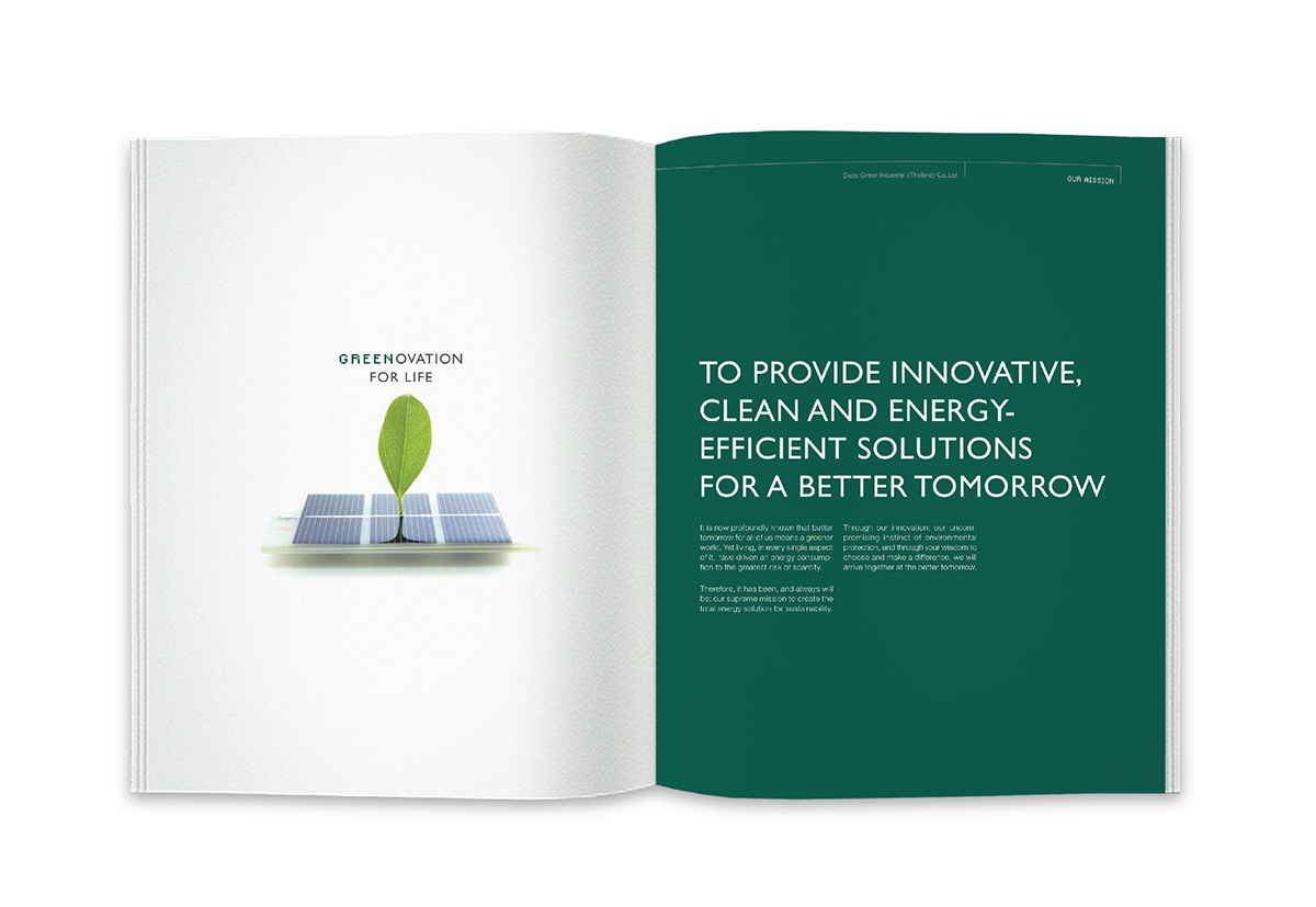
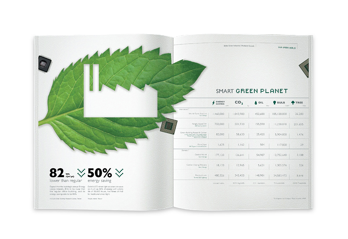
This project is to design the logo and company profile for Delta Green Industrial (Thailand) Co., Ltd.—a subsidiary of Delta Electronics (Thailand) Public Co., Ltd. manufacturing innovative products to respond to the preservation of the environment and energy.